Thursday 23 April 2015
Wednesday 22 April 2015
Evaluation| Question 3
What have you learned from your audience feedback?
Target Audience Profile:
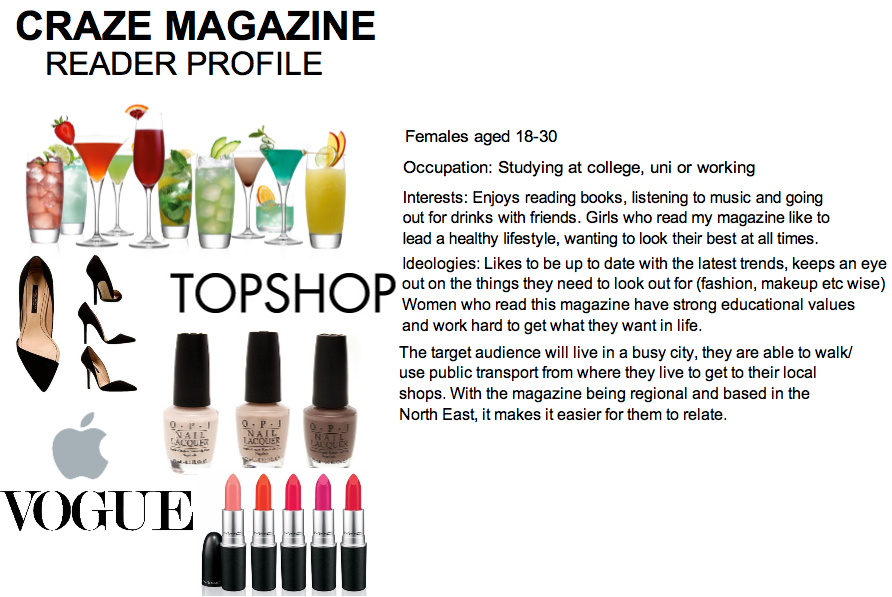
Audience feedback was one of the most important things that I had to take into consideration before creating my media products. Before making a start on any of my magazine, I created a questionnaire which I then went onto ask different people about what they would like to see in my magazine. This would therefore help give me a better understanding of who my target audience was and what they wanted from my media product. When I started thinking about my media products, I initially had an idea of what I personally wanted to achieve but it was important that I had some other opinions on it. Once I had been given the results back, I learnt from my audience feedback and improved on my initial ideas. In relation back to my own product, I knew what to include as I learnt what people were interested in and can relate it back to the genre of the magazine by focusing on fashion based articles as this was the most popular choice. This was very helpful as it had given me a better understanding of what my audience want and has given me ideas of how I can produce my magazine into being the best it possibly can be.
 |
| Some results from questionnaire |

I learnt that my target audience would be interested in reading my magazine from feedback on Facebook. I asked girls who fitted in the age range for my magazine, this way it ensured I would get the feedback from people who the product is initially aimed at. I also found that Facebook was a good way to get Target Audience research done as it was a way I could get in contact with people who would be interested in buying my magazine.
https://prezi.com/b9i7b1embvpt/what-have-you-learned-from-audience-feedback/


Saturday 18 April 2015
Coursework Feedback

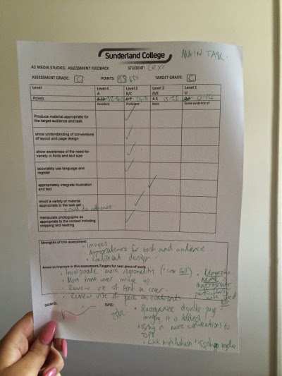

This is the feedback that I received from my lecturer which was for my main task, ancillary tasks and website. I am really happy with the grades I have achieved so far but I feel if I take on the feedback given, I will be able to improve my products in order for me to get an even better grade.
I have found the feedback really helpful and I understand what sort of things I can do to my product for me to improve the grade I've gotten. I found that when looking at all 3 feedback sheets, the main thing for me to do is to add more regionality into my products. This is very important to do as this is what is part of the criteria for the coursework.
Wednesday 1 April 2015
Progress

This is my completed billboard which in comparison to my other post on it previously, it has changed quite a bit. With me changing my magazine name from MINK to CRAZE, I had to put a new title on with this as the name instead. I also sharpened the image slightly in order for it to come out in the best quality possible, I then played around with the brightness and contrast till I thought it looked best. As part of the coursework, the magazine that I created had to be regional so I had to incorporate regionality into my billboard somehow. I decided to mention the North East in a small heading below the title which then linked in with the genre of my magazine by talking about women and fashion.
Saturday 14 March 2015
Magazine Name
When I first began creating my magazine, the initial name idea for it was MINK. I went along creating some of the magazine, using this name. However, when doing some research for my magazine, I came across the company 'Peta' which is an animal rights campaign. Their campaign opposes the use of animals for producing clothing that utilizes fur, leather, wool, or silk.
 |
| PETA Asia-Pacific supports the PETA campaign "I'd Rather Go Naked Than Wear Fur", in which celebrities appear nude to express their opposition to wearing fur. |
Mink is a common name for a mammal of the Mustelidae family which also includes otters, weasels, badgers, wolverines, and polecats. When I came up with the name, it wasn't chosen because of the animal. Mink is also a colour which was the reason behind me using this for my magazine name.
However, after looking at the Peta campaign and researching into the background of using animal fur, I thought it would be more suitable to change my magazine name. Fur is massive thing in the fashion industry, coming from both sides of being against the use of it or being all for it.
The model on my magazine is also wearing a faux fur jacket on the front cover, if I had kept MINK as my magazine name, I realised that this would of caused a lot of controversy.
I have decided to re name my magazine 'CRAZE' as this is definitely more suitable for my genre and fits in with the idea of fashion being a 'craze.'
Wednesday 21 January 2015
DPS update

This is my double page spread which still has a lot of work to do on it. I decided to use a staple Autumn fashion piece as the focus of my magazine so that it linked in with the theme and genre of my magazine.
Thursday 15 January 2015
Peer Assessment
 In todays media lesson, each student went around the computers in the class and wrote two positives and one improvement on post-it notes in order to get an idea of how well we are doing with our blogs. The overall feedback I got was very positive and it was good to read what other people thought about my blog. A lot of people commented on how detailed my posts were and that I had put lots of research into the work that I was doing. The improvements that included me using more platforms to show my work as I haven't really used a variety of them, so this is feedback that I will definitely be taking on board.
After reading through the feedback, I looked through my blog myself and made a few points on which I thought were good and how I could improve my blog. What I really like about my blog is the overall design of it and that I try to keep it as organised as possible, making it look well presented and professional. One thing that I found I could improve on is including more time management posts. I don't really have many which shows my progress and how I am handling my work to meet deadlines etc, so this is something I will begin doing.
Friday 9 January 2015
Progress| 2

This is the billboard for my magazine which I think is nearly completed. I am very happy with the way this looks but I am thinking of changing the colour of the font below 'MINK' to make it bait more clear and easy to read. With it being a billboard, it is important that everything stands out and the audience will be able to see everything on it.
I am also really happy with this image as the quality turned out really well and I think it fits well with the genre of the magazine.
Wednesday 7 January 2015
Progress
 This is my contents page so far. I still have a lot of work to do on it as there is a lot of dead space and I feel like there should be more colour on it somehow.
Progress

Originally I planned to have a dark lip on my model, but when it came to the actual photo shoot, I decided to change it to a nude lip as it suited the overall look better.
Subscribe to:
Posts (Atom)