 |
| Editing blog posts |
Friday, 24 October 2014
Time Management
Practice Photography


 To get an idea of how I want my own pictures to look for my final product, I took some practice images. I made sure that I took pictures that were suitable for my front cover, contents page and double page spread. I tried taking a range of different images that would be suitable with my magazine and also that fitted with the genre. After practicing taking my images, I will have a much better understanding of how I want my final pictures to turn out. I know what I need to do in order to get the right lighting and what sort of shots will look on my product.
Wednesday, 22 October 2014
Marking Criteria


I have been given a marking criteria to help give me an understanding of where I am currently at on my blog. The criteria talks about the sort of content that should be on my blog in order for me to reach a certain level. As part of the task, I looked through my own blog whilst checking the criteria to see what sort of mark I would get. I have decided to give myself a grade D so far, this is because I still have work yet to complete and feel like I could add a lot more to my time management.
Saturday, 18 October 2014
Quantitive Research
I created a questionnaire asking questions about my magazine so that I would be to get a better understanding of my audience and see what their feedback was. I gave it out to 15 people which is a good number in order for me to get a range of different answers and opinions.
 I asked people how much they would be willing to pay for the magazine and it came back that the price range of £2.00-£2.50 was the most popular. It is important that I take this feedback into consideration when creating my own product so that it meets my audiences needs. I think £2.50 is a good price to have my magazine as it will be issued monthly and is affordable for people who may be on a budget.
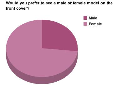 The majority of people who answered this questionnaire said that they would prefer to see a female model. This is very helpful as I was planning on using a female for my front cover and I think it will help to appeal to my audience more. Also, with the genre of my magazine being fashion, I think it will be more suited to having a female model as it gives my audience a chance to relate with them and see how clothing items look etc.
  The most popular content that people would like to see inside the magazine is interviews and articles talking about the latest trends. In relation to my own product, I now know what to include as this is what people are interested in and I am able to relate it back to the genre of the magazine by focusing on fashion based articles. This has been very helpful as it has given me a lot better understanding of what my audience want and has given me ideas of how I can produce my magazine into being the best it possibly can be.
Wednesday, 15 October 2014
My Magazine| Font Ideas and Name
I have decided to call my product 'MINK' magazine, so I have created a few diagrams showing the masthead written in fonts that I like and am thinking of using.

This is the first font that I am thinking of using as my masthead for the front cover of my magazine. This is a similar font to the one that Vogue uses which is the inspiration behind me choosing this font. Even though it isn't bold, you would still be able to read it clearly and it adds to thee overall sophisticated and classy look.

This is a typical font which you would see used for a masthead as the writing is extremely bold, making it stand out to the audience. If I have a lot of things going on in my front cover (i.e a lot of sell lines and pictures) then you would still be able to recognise the magazine and it would be clear to read.

I am planning on using this font for my main text inside the magazine. For example, I am going to use it for the contents page text and for the double page spread article. It is a simple, plain font which is easy for people to read and won't take the reader away from what else is going on.
Friday, 10 October 2014
Reconstruction| Website

This reconstruction required a lot of time and patience as I had to include boxes and had to fit everything together in order for it to look like the original. I created everything on photoshop, but did have to copy the social network logos and paste them onto my product. As you can see, I have made a spelling mistake and was unable to correct it as photoshop had already saved my work. When creating my final product, I have to make sure that mistakes like this doesn't happen and will have to constantly check over my work. Again, I managed to find a font that was similar to the one company uses which helps to add to the look of the reconstruction.

Reconstruction| Billboard


This is a billboard which advertises the well known brand Chanel. The model on the original advertisement is wearing glasses, so to complete the reconstruction mine is too. Creating this was very simple, I also managed to find a font on the website Dafont which was very similar to the one Chanel uses. I created a canvas which was landscape then fitted the image on the top which has been helpful because when it comes to creating the actual product, I will know what to do.
Thursday, 9 October 2014
Time Management
At this current moment, I would say the work going into my research and planning is nearly complete. There is still quite a few things that I need to complete, such as photoshoot planning (along with costume, prop etc planning). I also need to start on the reconstructions of a Website and Billboard, I have already finished doing my Front cover, Contents page and DPS.
Wednesday, 8 October 2014
The Recce
My photoshoot is going to be taking place inside my own house where I have blank walls so the editing process of the photos is a lot easier to do.Although that this is a safe environment, there may be a few hazards that I will have to take into consideration when moving around (both me and my model). It is important that during the photoshoot, everyone watches where they are walking and keep an eye out for plugs and wires that may be on the floor to ensure no falling over/tripping. Nevertheless, I will make sure that these hazards will be reduced that making sure that we don't walk near the wires. Another hazard that we may come across is the curtains that are next to the wall. If the model was to catch the bottom of it, she could fall over and it could damage property or hurt herself. To prevent this from happening, I will make sure that my model won't be wearing any footwear or clothing that could cause this to happen and will inform her that she will have to be careful when moving about. As I have a dressing room where my model can be styled and dressed, a safety risk that also needs to be considered is making sure that any straighteners or curlers are turned off in order to prevent anyone from burning themselves.
The time of day and the weather won't luckily affect the outcome of my photos as the images are being taken inside. However, if I were to take my pictures outside for any of the ancillary tasks, I would have to take the weather into consideration. Although the weather may not affect my photos, it could possibly affect the models hair and makeup if it was raining and we walked down to the location. I have decided to not take my images outdoors as the weather change quickly and the lighting would be different in every shot, which is something that I would not want to happen.
I will be using a white backdrop for the background of my model as this will make her stand out and will allow the audience to focus on only her. This also helps when it comes to the editing of the images as it means that if I want to add any colour or crop anything out, it will be a lot easier for me to do.
I am renting out a professional camera from my college which I have taken some practice photos with, so I know how to work it. Also, I would imagine that using flash would be the best thing to do as it will help to improve the quality of the images and bring out the colour in my model. With the photo shoot being taken at my house, it is easier for me to set up my camera and sort out all of the equipment that is needed. It is an easy location for my model to get to and we don't have a certain time limit of how long we can spend on taking the photographs.
I have stayed in contact with my model to make sure that everything will come together at the appointed time for the shoot. I have organised and sorted out when we are both free and when is the best time to take the images. I have also given my model a list to ensure she knows what sort of clothing and accessories she needs to bring, this way she won't forget anything that is needed on the shot and the photographs turn out how I planned them.
 |
| White wall for background of photo |
 |
| Risks- Straighteners wire |
Peer Assessment

I found this task very useful as it has given me a good a understanding of where my blog is at when looking at a success criteria. By looking at this criteria also means that I know what sort of things I need to do in order to achieve level 4, which is a grade that I would like to get.
Although my partners blog is following a different brief to mine, it has been helpful to see what sort of content she has been producing and how our products are in anyway similar.
Friday, 3 October 2014
Reconstruction| Double Page Spread


This has helped me have a better understanding of how a fashion magazine layout their double page spreads and has also given me inspiration in relation to my own product.
Reconstruction| Contents Page

As well as my front cover, I have created a reconstruction of a contents page taken from Glamour magazine. I took the image on my phone and created everything on my own on photoshop.
I found a font which was similar to the Glamour one and managed to get similar colours to the original title. Compared to the creation of my front cover, I found this task more difficult as I had to try and fit everything on which was the actual content.
Again, the clothing on my model isn't the same as the Glamour magazine model,but I made sure that the pose was likewise to it and the layout was almost identical.
In addition, I had a tab open of the original image on photoshop and kept switching over just to make sure that everything was alike.
Thursday, 2 October 2014
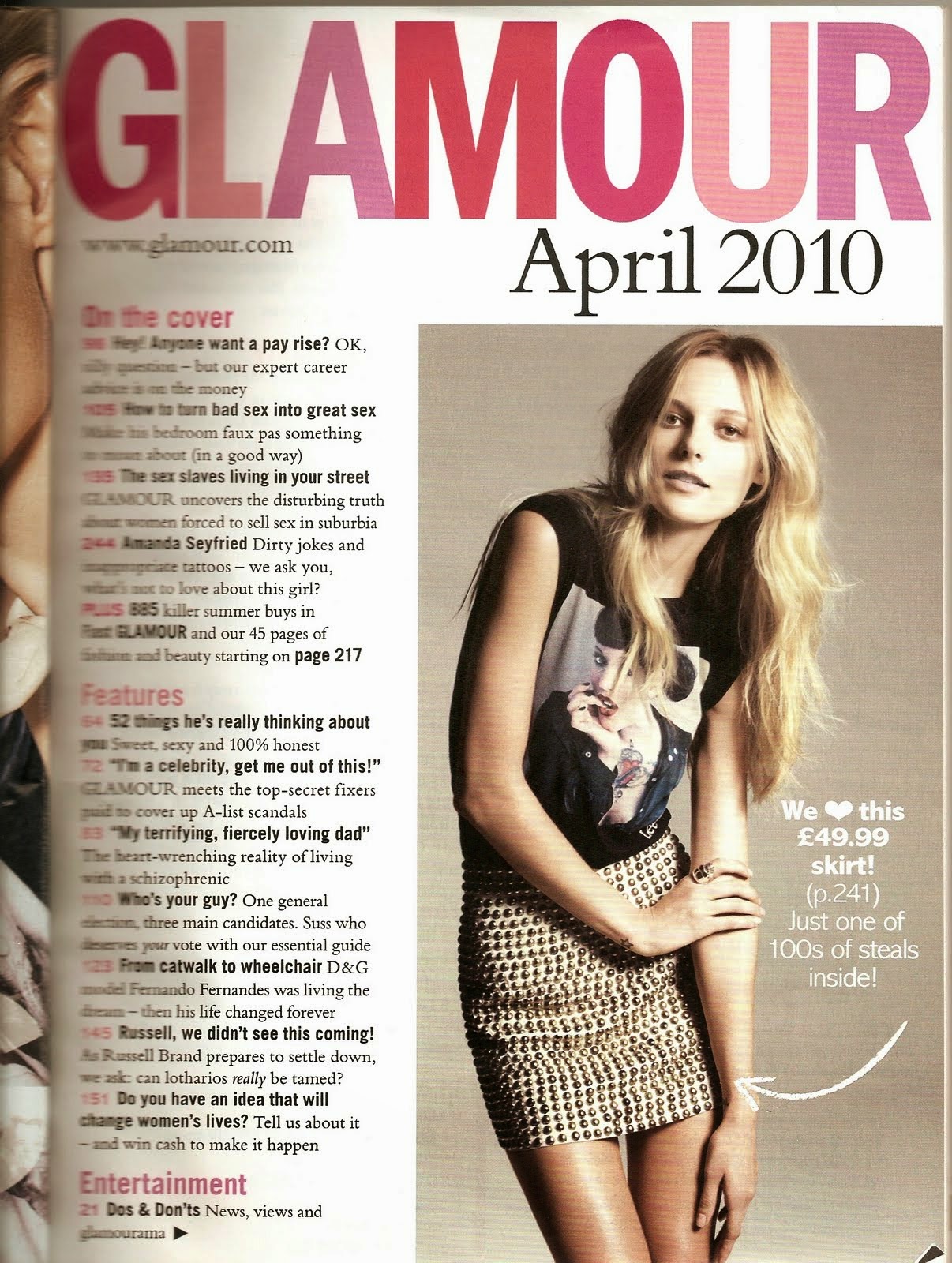
Reconstruction| Front Cover


As part of my research and planning, I have reconstructed a front cover taken from the fashion magazine TeenVogue. I found that this cover was suitable to do as my model was quite similar to the original image and I thought that it would be quite simple to recreate. I took the TeenVogue cover from google images then recreated my take on it on Adobe Photoshop. As this was a reconstruction task, I had to make sure that everything that I done was similar to how the original cover looked.
While I was creating the reconstruction, I had a tab open of the original image in order for me to get everything as likewise as I could.
I took my image against a white background which made it easy to edit the blue behind the model, this also allowed me to have the faded colour at the bottom of the cover. In addition to this, I didn't have to crop any image of the model, instead I used a paint brush and covered any white parts that were visible. In relation to my own product, I am definitely going to take my own images in front of a white background as this will make the editing of the photos process a lot easier incase I want to change any colouring etc.
Although, the clothes on my model aren't similar to the ones on the Vogue cover, I tried to make sure that the makeup and hair looked similar in order to show to the reconstruction.
I managed to find a font on Dafont, which was similar to the font used for the 'Vogue' on the front cover. Now I have this font on photoshop installed, I am thinking of using it for the masthead of my own regional magazine as this is something I have taken inspiration from during my research.
I also found that photoshop already had some fonts that had a resemblance to the original which made it a lot easier for me during the process of the reconstruction.
Whilst creating my own take on the original, I found it quite easy as I didn't have to place the masthead behind the image and all the sell lines were simple to insert.
Wednesday, 1 October 2014
Deconstruction| Website
I have created a PowToon which talks about 3 different fashion magazine websites, both regional and international.
Subscribe to:
Posts (Atom)