
Thursday, 27 November 2014
Photo shoot Preparation
Sunday, 16 November 2014
Photo shoot Planning
As my magazine is a regional fashion magazine, I want my photographs to reflect this and make sure that the images help to appeal to my target audience. After looking at various fashion magazines such as Elle and Vogue, I found that most models on the front covers are presented as being powerful and dominant. I want my readers to be able to feel like they can relate to the model on the front cover and hopefully I can do this by using images that portray her as being like someone who they can look up to. I have concentrated on looking at a range of different makeup techniques, clothing and props etc in order for me to get the best idea of what my audience want when reading a magazine.
The clothes on my model will be from high street shops such as Topshop, Zara etc due to the fact I am creating a regional magazine. This will also appeal to the target audience as these are relatively cheap shops and represent the genre of my magazine.
Friday, 14 November 2014
Time Management
This is my how my magazine currently looks. I have only started working on the layout of my front cover and contents page as I am yet to write up the article for my DPS. I haven't got the photos yet as I am seeing my model on the 15th November, so I have started creating how it will look. I have added the masthead and added the main sell lines onto my front cover whereas for my contents i have included all the features inside of the magazine. I am very happy with how my magazine looks at the moment and I can't wait to see what it will look like with my pictures.


Wednesday, 12 November 2014
Potential Problems
Some of the problems that I may face when it comes to the making of my magazine is that when I take my images, the weather may be bad. Now although my images are being taken indoors, I would like to use natural lighting which comes through the window to make the images look as best as possible. If the weather isn't too good on day of the images being took, I will reduce this problem by simply using the flash on the camera and adjusting the lights in the room.
Confirmation from my model

 This is a confirmation message from my model saying that she is available to still come and take the images for my magazine. It is important that we keep in touch with each other so we know that the times are suitable for both of us. I want everything to go to plan when taking my images so this is important to know. I also sent her this list which is what I needed her to bring for the photo shoot clothing wise.
Thursday, 6 November 2014
Photo shoot| Makeup & Hair Ideas
 |
| Makeup Ideas |
As part of my research and planning, I have been looking at different celebrities makeup to get inspiration for what sort of look I want to recreate on my own model. As I am planning on doing a Autumn edition of my magazine, it was important that I done some research into what sort of makeup looks are being worn at the moment. Dark red and berry toned lipsticks are very popular colours to be worn during autumn, it is the perfect way to vamp up any look you are wearing. The pictures above are of some of my favourite makeup looks I have seen and in relation to my own product, these looks are exactly how I want my models to look. Choosing the right makeup for the front cover of my magazine is very important in order for the audience to be able to understand that it is an Autumn edition and it fits in with the theme of the product.
List of products I would like to use on my model:
- Full coverage foundation- It is important that there is no SPF so it doesn't cause flashback on the photos and doesn't cast a white shade on the models face.
- Strong dark brows- Helps to define the face.
- False eyelashes- Perfect way to finish off a look and add extra thickness and volume to the models own lashes.
- Bronzer- Add colour back in to the face.
- Dark vampy lipstick.
 |
| Hair Ideas |
Friday, 24 October 2014
Time Management
 |
| Editing blog posts |
Practice Photography


 To get an idea of how I want my own pictures to look for my final product, I took some practice images. I made sure that I took pictures that were suitable for my front cover, contents page and double page spread. I tried taking a range of different images that would be suitable with my magazine and also that fitted with the genre. After practicing taking my images, I will have a much better understanding of how I want my final pictures to turn out. I know what I need to do in order to get the right lighting and what sort of shots will look on my product.
Wednesday, 22 October 2014
Marking Criteria


I have been given a marking criteria to help give me an understanding of where I am currently at on my blog. The criteria talks about the sort of content that should be on my blog in order for me to reach a certain level. As part of the task, I looked through my own blog whilst checking the criteria to see what sort of mark I would get. I have decided to give myself a grade D so far, this is because I still have work yet to complete and feel like I could add a lot more to my time management.
Saturday, 18 October 2014
Quantitive Research
I created a questionnaire asking questions about my magazine so that I would be to get a better understanding of my audience and see what their feedback was. I gave it out to 15 people which is a good number in order for me to get a range of different answers and opinions.
 I asked people how much they would be willing to pay for the magazine and it came back that the price range of £2.00-£2.50 was the most popular. It is important that I take this feedback into consideration when creating my own product so that it meets my audiences needs. I think £2.50 is a good price to have my magazine as it will be issued monthly and is affordable for people who may be on a budget.
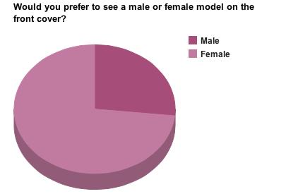 The majority of people who answered this questionnaire said that they would prefer to see a female model. This is very helpful as I was planning on using a female for my front cover and I think it will help to appeal to my audience more. Also, with the genre of my magazine being fashion, I think it will be more suited to having a female model as it gives my audience a chance to relate with them and see how clothing items look etc.
  The most popular content that people would like to see inside the magazine is interviews and articles talking about the latest trends. In relation to my own product, I now know what to include as this is what people are interested in and I am able to relate it back to the genre of the magazine by focusing on fashion based articles. This has been very helpful as it has given me a lot better understanding of what my audience want and has given me ideas of how I can produce my magazine into being the best it possibly can be.
Wednesday, 15 October 2014
My Magazine| Font Ideas and Name
I have decided to call my product 'MINK' magazine, so I have created a few diagrams showing the masthead written in fonts that I like and am thinking of using.

This is the first font that I am thinking of using as my masthead for the front cover of my magazine. This is a similar font to the one that Vogue uses which is the inspiration behind me choosing this font. Even though it isn't bold, you would still be able to read it clearly and it adds to thee overall sophisticated and classy look.

This is a typical font which you would see used for a masthead as the writing is extremely bold, making it stand out to the audience. If I have a lot of things going on in my front cover (i.e a lot of sell lines and pictures) then you would still be able to recognise the magazine and it would be clear to read.

I am planning on using this font for my main text inside the magazine. For example, I am going to use it for the contents page text and for the double page spread article. It is a simple, plain font which is easy for people to read and won't take the reader away from what else is going on.
Friday, 10 October 2014
Reconstruction| Website

This reconstruction required a lot of time and patience as I had to include boxes and had to fit everything together in order for it to look like the original. I created everything on photoshop, but did have to copy the social network logos and paste them onto my product. As you can see, I have made a spelling mistake and was unable to correct it as photoshop had already saved my work. When creating my final product, I have to make sure that mistakes like this doesn't happen and will have to constantly check over my work. Again, I managed to find a font that was similar to the one company uses which helps to add to the look of the reconstruction.

Reconstruction| Billboard


This is a billboard which advertises the well known brand Chanel. The model on the original advertisement is wearing glasses, so to complete the reconstruction mine is too. Creating this was very simple, I also managed to find a font on the website Dafont which was very similar to the one Chanel uses. I created a canvas which was landscape then fitted the image on the top which has been helpful because when it comes to creating the actual product, I will know what to do.
Thursday, 9 October 2014
Time Management
At this current moment, I would say the work going into my research and planning is nearly complete. There is still quite a few things that I need to complete, such as photoshoot planning (along with costume, prop etc planning). I also need to start on the reconstructions of a Website and Billboard, I have already finished doing my Front cover, Contents page and DPS.
Wednesday, 8 October 2014
The Recce
My photoshoot is going to be taking place inside my own house where I have blank walls so the editing process of the photos is a lot easier to do.Although that this is a safe environment, there may be a few hazards that I will have to take into consideration when moving around (both me and my model). It is important that during the photoshoot, everyone watches where they are walking and keep an eye out for plugs and wires that may be on the floor to ensure no falling over/tripping. Nevertheless, I will make sure that these hazards will be reduced that making sure that we don't walk near the wires. Another hazard that we may come across is the curtains that are next to the wall. If the model was to catch the bottom of it, she could fall over and it could damage property or hurt herself. To prevent this from happening, I will make sure that my model won't be wearing any footwear or clothing that could cause this to happen and will inform her that she will have to be careful when moving about. As I have a dressing room where my model can be styled and dressed, a safety risk that also needs to be considered is making sure that any straighteners or curlers are turned off in order to prevent anyone from burning themselves.
The time of day and the weather won't luckily affect the outcome of my photos as the images are being taken inside. However, if I were to take my pictures outside for any of the ancillary tasks, I would have to take the weather into consideration. Although the weather may not affect my photos, it could possibly affect the models hair and makeup if it was raining and we walked down to the location. I have decided to not take my images outdoors as the weather change quickly and the lighting would be different in every shot, which is something that I would not want to happen.
I will be using a white backdrop for the background of my model as this will make her stand out and will allow the audience to focus on only her. This also helps when it comes to the editing of the images as it means that if I want to add any colour or crop anything out, it will be a lot easier for me to do.
I am renting out a professional camera from my college which I have taken some practice photos with, so I know how to work it. Also, I would imagine that using flash would be the best thing to do as it will help to improve the quality of the images and bring out the colour in my model. With the photo shoot being taken at my house, it is easier for me to set up my camera and sort out all of the equipment that is needed. It is an easy location for my model to get to and we don't have a certain time limit of how long we can spend on taking the photographs.
I have stayed in contact with my model to make sure that everything will come together at the appointed time for the shoot. I have organised and sorted out when we are both free and when is the best time to take the images. I have also given my model a list to ensure she knows what sort of clothing and accessories she needs to bring, this way she won't forget anything that is needed on the shot and the photographs turn out how I planned them.
 |
| White wall for background of photo |
 |
| Risks- Straighteners wire |
Peer Assessment

I found this task very useful as it has given me a good a understanding of where my blog is at when looking at a success criteria. By looking at this criteria also means that I know what sort of things I need to do in order to achieve level 4, which is a grade that I would like to get.
Although my partners blog is following a different brief to mine, it has been helpful to see what sort of content she has been producing and how our products are in anyway similar.
Friday, 3 October 2014
Reconstruction| Double Page Spread


This has helped me have a better understanding of how a fashion magazine layout their double page spreads and has also given me inspiration in relation to my own product.
Reconstruction| Contents Page

As well as my front cover, I have created a reconstruction of a contents page taken from Glamour magazine. I took the image on my phone and created everything on my own on photoshop.
I found a font which was similar to the Glamour one and managed to get similar colours to the original title. Compared to the creation of my front cover, I found this task more difficult as I had to try and fit everything on which was the actual content.
Again, the clothing on my model isn't the same as the Glamour magazine model,but I made sure that the pose was likewise to it and the layout was almost identical.
In addition, I had a tab open of the original image on photoshop and kept switching over just to make sure that everything was alike.
Thursday, 2 October 2014
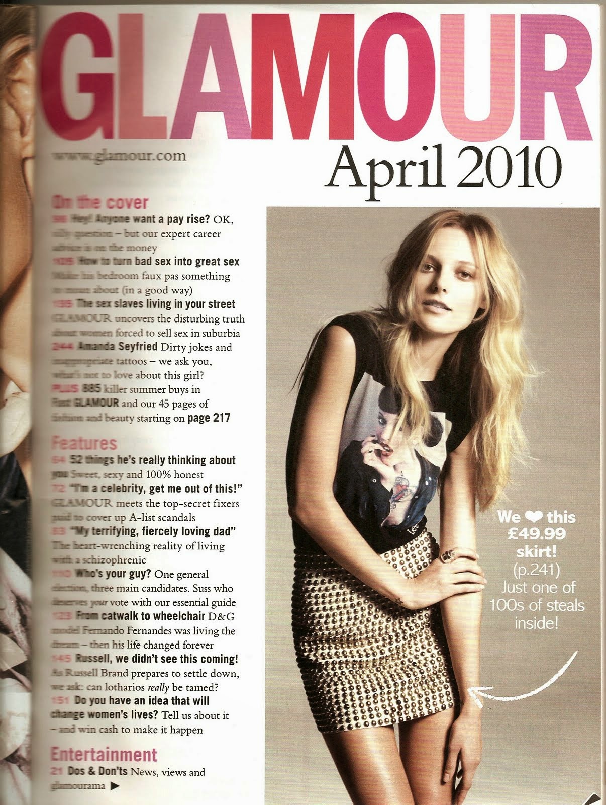
Reconstruction| Front Cover


As part of my research and planning, I have reconstructed a front cover taken from the fashion magazine TeenVogue. I found that this cover was suitable to do as my model was quite similar to the original image and I thought that it would be quite simple to recreate. I took the TeenVogue cover from google images then recreated my take on it on Adobe Photoshop. As this was a reconstruction task, I had to make sure that everything that I done was similar to how the original cover looked.
While I was creating the reconstruction, I had a tab open of the original image in order for me to get everything as likewise as I could.
I took my image against a white background which made it easy to edit the blue behind the model, this also allowed me to have the faded colour at the bottom of the cover. In addition to this, I didn't have to crop any image of the model, instead I used a paint brush and covered any white parts that were visible. In relation to my own product, I am definitely going to take my own images in front of a white background as this will make the editing of the photos process a lot easier incase I want to change any colouring etc.
Although, the clothes on my model aren't similar to the ones on the Vogue cover, I tried to make sure that the makeup and hair looked similar in order to show to the reconstruction.
I managed to find a font on Dafont, which was similar to the font used for the 'Vogue' on the front cover. Now I have this font on photoshop installed, I am thinking of using it for the masthead of my own regional magazine as this is something I have taken inspiration from during my research.
I also found that photoshop already had some fonts that had a resemblance to the original which made it a lot easier for me during the process of the reconstruction.
Whilst creating my own take on the original, I found it quite easy as I didn't have to place the masthead behind the image and all the sell lines were simple to insert.
Wednesday, 1 October 2014
Deconstruction| Website
I have created a PowToon which talks about 3 different fashion magazine websites, both regional and international.
Friday, 26 September 2014
Deconstruction| Billboard

This is a billboard which is advertising the fashion brand 'Forever 21' which is clothing for women and men. The colouring on this billboard is very simple, very much focusing on the image and the name of the brand. This is something I am going to take into consideration when creating my own, I want the company name to attract the audience and stick in their minds. Also, as my magazine is going to have a simple colour scheme and classic layout, this will also match with how that looks and my target audience will know they are linked together.
Although the writing takes up the billboard, the image behind is still very clear and stands out. With the text being so large, it is easy to identify and read and would be the first thing someone would notice
if passing by.


Flat Plan| Double Page Spread

Colour Usage: This double page spread is the only part of my magazine where I am not going to have the same colour scheme as my front cover and contents page. I am undecided on what sort of colours I am going to use but I know I'm going use black as the main font for the text in the article.
Image Usage: I am only going to use one image on this page as I plan on making it take up the page without the text/interview. As the genre of my magazine is fashion, I might plan on taking a long shot photo in order for the audience to see the outfit that my model is wearing and get inspiration from the clothing in the image.
Text Usage: Depending on what my article is going to be, a interview or review etc, my text will be quite a mix of formal and informal. For example, If I do use a interview for my double page spread then it is quite likely that the questions will be written in a formal tone and the answers could be replied informally.
Layout and Font: The layout will proceed to be well presented and organised so it looks more appealing to the reader. When doing my research and planning, the main convention of a double page spread is that the text is written in columns so that it looks well presented and is easy to follow. I want to keep the fonts very simple for the text, it will be the same font that I used to write the text for my contents page. The title of the masthead will be written in a bold font to stand out and I plan on using a rhetorical question as a caption to draw the reader in.
Flat Plan| Contents Page

Colour Usage: On my contents page, I am going to have the same colour scheme that I used on my front cover. I think this looks a lot more professional and sophisticated which is a look that I would like to go for. As I am using monochrome colours, I plan on taking images that will help to add more colour to the page so it doesn't look too boring in basic black and white. I could also add more colour by putting the page numbers in something other than black and white, maybe red or pink.
Image Usage: I plan on using one quite large image which will relate back to the model on the front cover and then use images that fit with the content inside of the rest of the magazine. I am going to include the page number on top of the image as I think this is a good technique use in order to give the reader a better understanding of the articles.
Text Usage: I would still like the narrative voice to continue being quite formal like how it is on the front cover. The best way to grab the readers attention, particularly in my genre of magazine, is to talk to them in a friendly and personal tone so it makes them feel apart of what they are reading. However, it is still important that the way I write my content is professional. I am going to make sure that subheadings are used in order to split the articles into different sections that they fall under and this helps to make it easier for the reader to follow. It is important that subheadings are used to split up the articles into different sections so it makes it easier for the reader to find certain features. The regional magazine "Luxe" also does this which is something I have taken inspiration from.
Layout and Font: When doing my own research into regional fashion magazines, I have found that the best magazines are the ones that have the images precisely placed and look organized. It is important that the reader can easily understand what is going on and everything is clear to see. I am going to write the name of the magazine on the contents page as this is a convention I have found a lot of fashion magazines tend to do. I want to find a simple, plain font that I can use for my text but will look quite similar to the masthead.
Flat Plan| Front Cover

Front Cover
Colour Usage: The colours that I have decided to use on the front cover of my magazine are very neutral and cool toned. With the genre of my magazine being fashion, I want it to look quite simplistic and have everything focused on the image. The main colours that I would like to use are black, white and maybe pink. As the magazine is aimed at woman, pink has connotations of femininity and will attract the target audience.
Image Usage: After thinking about what my main image wanted to be like for my front cover and researching the different conventions, I would like a woman model on the front cover. When doing research into the conventions, I found that both regional and international fashion magazines have a woman as their model. As I am creating a regional magazine, I plan on dressing my model in clothes from the high street in order for my target audience to achieve the same sort of looks that they will see in the magazine. I am undecided wether I want to use props in my image, but I will decide this after I have taken some images to see if it looks better with or without. I would like the hair of my model to either be down, curled or straightened, or up depending on what the model feels comfortable with. The most important thing about the main image is that it is of good quality and doesn't turn out looking pixelated and blurry.
Text Usage: The narrative of the text will come across as quite formal to the reader, but will still be very friendly so it appeals to the target audience. The target audience of my magazine is aimed at 16-30, so I think it is important that I use language that is professional and relates to my genre, but I will still make sure that the magazine looks entertaining. I plan on using a main sell line which will relate to the models article on my double page spread and then use sub headings around the image which will talk about the content inside of the magazine.
Layout and Font: I have decided that I want my masthead to be in a basic font but written bold as this will help to grab the readers attention. I have taken inspiration from the magazines Elle and Harper's Bazaar for the fonts that they have used and I hope to find something similar to the fonts they use. As you can see in the image above, I would like my masthead placed at the top of the front cover so that the audience can easily recognise it. The main image itself will be a mid shot and will take up the whole front cover, with all the text placed around and on it. The regional magazine 'ETC' has a footer at the bottom of their front cover which is something I have took inspiration from and would like to incorporate into my own magazine.
Friday, 19 September 2014
My Own Institution
The Powtoon above will inform you about the institution which I have created to publish my magazine. Whilst doing my research, I found that the only regional institution in the North East which I could possibly use was Johnston Press. However, I have decided to create my own institution which means that I will have more control over the publishing process of my magazine.
As I have explained in the presentation, the institution will be ran in a office in the North East and will also publish other regional magazines which will include different genres, i.e music and food.
Monday, 15 September 2014
Time Management
Currently, I have done quite a few posts but I still have a lot of work to go into my research and planning in order to get the highest grade possible. I would say I am nearly half way through my work, I need to put up posts that include flat plans for my magazine and reconstruction's of every product I am producing for this task. I am enjoying creating these posts and I keep checking with my action plan in order to make sure everything is finished for their deadlines.
Friday, 12 September 2014
Feedback From My Pitch Presentation

This is the feedback that I have gotten from the students in my class about my pitch presentation.
I created my powerpoint on google drive, then opened it up so that everyone could go round to read it and give it feedback.
We were told to give two positive comments, then something that we could improve on.
I have found this task very helpful as I know what I can do to add onto my presentation and in order for it to be a lot more informative.
Pitch Presentation
This link will take you to my pitch presentation for my magazine which I created to show to the rest of the class.
Thursday, 11 September 2014
Deconstruction| Double Page Spread

The woman in the blue coat is the main image on the page and this image fits in well with the theme of the article. I like how a sort of shadow effect has been used behind the model which adds to the quirkiness of the DPS. Black is the only colour that has been used for the text on this page but colour has been added by the use of different images. However, at the start of the article the first letter of the word has been made larger and in a different colour which creates a professional look and makes on overall impact on how the article looks. Although the background is white and the pictures are only of small objects, it doesn't look as if there is dead space. However, I don't really like the look of the buttons and lipstick images as I think it makes the article look quite messy and unorganized. Also, the text has just been placed around the images which adds to how quite unprofessional it looks.
"How to stay in the style loop" has been placed just off the centre on the first page but has been written in a different font. This is to attract the reader as this will be the first thing they will most likely see and read, this line refers back to the genre of the magazine and how it is all about fashion. When creating my own product, I plan on using these type of sell lines in order to attract my target audience and so it keeps in relation to the genre of my magazine.
Deconstruction| Double Page Spread

The word "moments" has been written in the same font as the masthead on the front cover, I think this helps add professionalism to the overall look because everything fits together. The way this title has been written is in the same font as the masthead for Harper's Bazaar, which is an element I would like to take from this magazine and incorporate it into my own.
The questions have been written in a grey, bold font whereas the answers/replies have been written in a different colour. This helps for the interview to flow naturally, making it easier for the readers to follow. When creating my own DPS, this is exactly how I am going to set out my interview as this is something I have noticed a lot of fashion magazines do.
I also think that the colour scheme of this double page spread looks very sophisticated and classy, this is how I would like my own product to be like.
Deconstruction| Double Page Spread

The find that the background behind the model is the thing that the reader would be most drawn to due to the fact it looks somewhere exotic and it isn't something you would usually see as a background, most of the time its plain.
I like how the title has overlapped the main image and is still very clear to read, if I do this in my own magazine then I must make sure that this is how it looks.
At the side of the magazine, a rhetorical question is written which is direct to the audience to make it feel like they are going to be getting an insight into the models life. "What do three supermodels wear when the workday is done?" This article will automatically appeal to the target audience because although the readers won't have the same job as the model, they will be able to be similar to them when they find out what the models wear when they are finished work. Women take a lot of care in their appearance and most look forward to coming home and relaxing, getting into their comfy clothing. In relation to my own product, I definitely want to add rhetorical questions into my article as it helps to add more fun to the magazine and it gives a more personal feel to the audience as you are directly asking them a question in which they can answer.
"Kicking it" is used as a kind of strap line and the model is posing to match this phrase which adds slight quirkiness to the magazine as this isn't the sort of image you would expect to see in a fashion magazine.
Overall, I dislike the layout of this DPS and this is not how I would like my own product to be like. This is because I don't really like how this image is presented and how it takes up almost two pages of the article itself.
Subscribe to:
Posts (Atom)